Synesthesia: the ability to hear shapes, taste colors, or see music. For some, there is an involuntary reaction that happens between senses where one sensory trigger will consistently and predictably cause an interaction with another.
I think everyone has their own form of synesthesia. I have a friend who sees a number whenever they think of or interact with a person—odd numbers mean different things from even, and a person who is a four is entirely different from a person who is a forty. For me, months of the year follow the outline of a rectangle in my brain (starting with January in the upper left corner) so dates are physically placed in a specific spot along the perimeter.
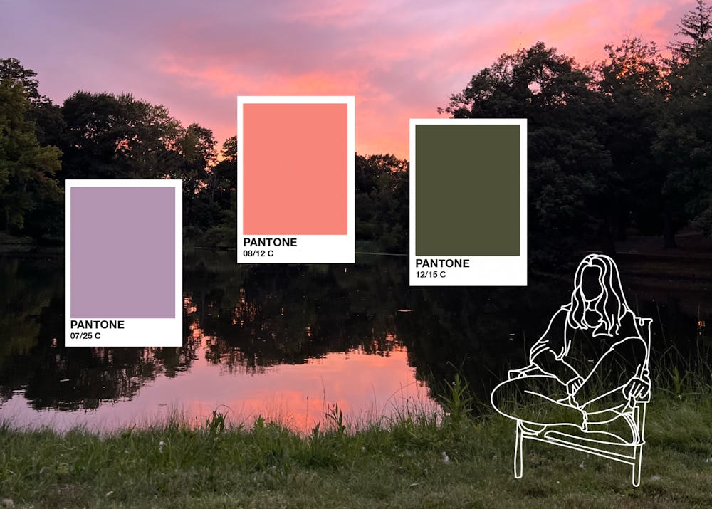
While I think it would be cool to taste the color of every wall I see, I don’t have synesthesia. What I tend to do though (and I guess will settle for) is see a color and immediately think of a person in my life who embodies that color. Perhaps the discrepancy between shades can be argued according to personal relationships with the individual, but I believe there is still a general agreement of color association. A guide to color-match your friends, a Pantone list of my dearly beloved:
Forest green (emerging from a dark turquoise), Pantone #3308
Different shades of green are entirely different people. Forest green people are well-balanced. It makes sense why I see you the least in our suite. You are far more balanced than I am, and now that I’m thinking about it, I haven’t seen you since Monday. Perhaps I could’ve seen you yesterday had I not gone to the 10:05 p.m. movie showing and woken up at 9:30 a.m. this morning. Let’s snuggle in your bed and watch The Parent Trap (Lindsay Lohan version only) soon, okay? I’ll roll the joint for us.
Forest green people settle into their specific shade and lean into it. For you, everything in your life has begun to be painted by those broad strokes. Forest green people probably run outdoors to exercise (maybe with a fanny pack strapped to the waist), do puzzles on Thanksgiving Day, and eat granola and non-dairy yogurt for breakfast (which, of course, they never skip).
Deep fuchsia, Pantone #0807
Deep fuchsia people will probably wear pants that are also deep fuschia. Maybe with pearls, too, and drive a dented car. Deep fuchsia is bright and loud and entertaining, and indeed, deep fuchsia people are all those things. They have strong personalities, but everyone could use a bit of deep fuschia in their life. Once you do, you might climb up fire escapes with them or jump out of planes from 14,000 feet together. They’ll have the dented car bouncing to the heaviest beat when picking you up from the station at 3 a.m., and maybe you’ll roam around the rainforest with them too. You pick, it’ll be a good time regardless.
Blue is blue the way white is white, at least for Pantone #0293
Classic, true, honest. It’s like when people have 18 pairs of blue jeans in their closet, there is still a single one that is the classic, love-worn staple, and the perfect shade of blue. You are my favorite pair of blue jeans. I would sacrifice all my other pairs in a heartbeat if it meant I could keep you.
Some days blues are a Pantone #2955 and other days, a Pantone #0298. If there was a set of ten markers and one of them was blue, the shade might be different between each brand of markers. But there will always be a blue marker—blue is blue the way you are you.
Yellow, Pantone #3935
“Yellow is capable of charming God.”
There is a physical effect with yellows. Seeing you has the same effect as sunlight when you’re seasonally depressed. You just make the world brighter in a literal way. You are just cavalierly happy and it’s infectious. Hues of yellow will of course differ, but there is an undeniable radiance of yellows. So let’s crochet together and cook dinner together with the rosemary from your impressively healthy dorm plant. Or we can put on goggles and go for a dip in the sound, but it’s colder now so maybe we can just go climbing together. Honestly, it doesn’t really matter what we do—as long as it’s with you, I know I’ll be okay.
Orange, Pantone #0804
Orange is for people who grow persimmons in their backyard, who re-wild their lawn to allow nature to reclaim its ground. Orange is for people who get emotional at cookbooks and unashamedly read romance novels while also reading Moby Dick. Orange is for people who are brilliant and are the exception to orange-color-haters. You are the exception and there is nothing quite like my love for you.
Moss green (in the context of a medallion yellow, Pantone #0130), Pantone #5767
Now, moss green is important because the context of the color will change its meaning entirely. Moss green has individualized relationships with its adjacent color, whatever it might be. Moss green people can never be generalized; their conversations with one person are like moss cultivated in a Japanese garden, and their conversations with another like moss as Christmas decoration.
Let’s consider a moss green next to a medallion yellow, Pantone #5767 to Pantone #0130, respectively. In this context, moss green people send postcards on roadtrips, will have a personal connection to the word “cabin”, and exclusively shopped at REI and Patagonia on Cyber Monday.
But that’s not to say moss greens can’t survive on their own. Moss, absent of roots and stems and leaves, can grow anywhere. In fact, moss comes alive in the rain.
How much more sweet, tasty, and brilliant the world around us becomes when colors come alive in this way.


